Menu

  • About
  • Home
  • Multimedia Work
  • Resume
  • Blog Feed
Skip to content

Dance Through the Decades

A collection of posts highlighting dance over the years

Illustrator

Final Logo

Posted on March 6, 2020 by autumnbuckosh

For my final logo I wanted to keep a majority of my original design with just a few minor details. When I was making my draft logo, I noticed that the timeline itself looked like a barre and that the pins on the line looked like dancers. In my draft logo, I added a thin circle around the tops of the pins to mimic the arms of a dancer in high fifth and for my final logo I wanted to make the barre illusion more apparent. Most barres have two bars connected to a post on either side. I added the other line at the bottom to give this effect but I made it’s weight slightly less than that of the main line so as to not distract from the timeline as a whole. I actually increased the weights of all the lines that were in my original draft by 1pt so that the addition of the other line would not degrade the design. I want my logo to be scaleable so the line weights are important to keep in mind. I kept the logo in black and white, again referring back to my graphic collage in which everything was in black and white to give a very timeless effect. I decided to keep the fonts the same because I like the effect that they give and I think they do a good job of highlighting my theme of “Dance” and “Decades”. Overall I am happy with the logo I created and I think it does a good job of conveying my theme.

Draft Logo

Posted on February 28, 2020 by autumnbuckosh

For my logo design I wanted to mimic a timeline as my theme is “Dance Through the Decades”. As I was playing around with the timeline design I found that the the lines going through the baseline almost looked like dancers at a barre so I added a thin circle around the dots to imitate a dancers arms in high fifth position. As I stated in my Photoshop collage, I think that ballet is one of the most important styles of dance and is very central to all other styles which is why I wanted to incorporate it into my logo. For the text I wanted to make “Dance” and “Decades” the most prominent words as they are the most important in my theme. For the words “through” and “the”, I wanted them to look as if they were flowing between “Dance” and “Decades” to give the effect that all the time is fluid. I kept the logo in black and white to reference back to my Photoshop collage to achieve the same timeless effect. I made sure that the line thickness was thick enough to scale up but kept it thin enough that it wasn’t overwhelming on the smaller scale. Overall, I wanted this logo to portray my theme in a fun way and I think that I achieved that. For my final logo I want to explore other fonts and possibly make the timeline resemble a barre more, but I like this logo as a starting place. Links I used for inspiration will be in the footnotes of this post.

https://designshack.net/articles/inspiration/10-tips-for-designing-logos-that-dont-suck/

https://mashable.com/2014/04/30/logo-design-tips/

Illustrator Tutorials

Posted on February 21, 2020 by autumnbuckosh

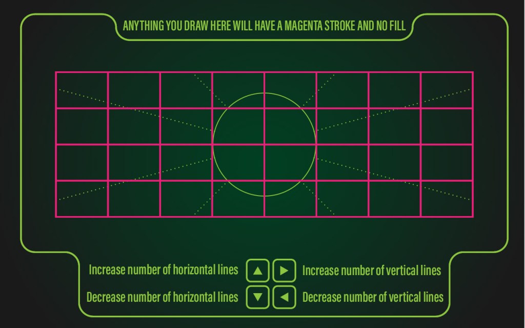
I did both the dashed and dotted lines in one artboard

Category Cloud

Audition Illustrator Logo My Story on the Web Photography Photoshop Premiere Tutorials
Blog at WordPress.com.
Privacy & Cookies: This site uses cookies. By continuing to use this website, you agree to their use.
To find out more, including how to control cookies, see here: Cookie Policy
  • Subscribe Subscribed
    Dance Through the Decades

    Have a WordPress.com account? Log in now.

  • Dance Through the Decades
    View site in Reader
    Manage subscriptionsSign upLog in
    Report this content
    Collapse this bar
Loading Comments...
Create your own website, free on WordPress.com.Create your own website.
Start free