Menu

  • About
  • Home
  • Multimedia Work
  • Resume
  • Blog Feed
Skip to content

Dance Through the Decades

A collection of posts highlighting dance over the years

Logo

Final Logo

Posted on March 6, 2020 by autumnbuckosh

For my final logo I wanted to keep a majority of my original design with just a few minor details. When I was making my draft logo, I noticed that the timeline itself looked like a barre and that the pins on the line looked like dancers. In my draft logo, I added a thin circle around the tops of the pins to mimic the arms of a dancer in high fifth and for my final logo I wanted to make the barre illusion more apparent. Most barres have two bars connected to a post on either side. I added the other line at the bottom to give this effect but I made it’s weight slightly less than that of the main line so as to not distract from the timeline as a whole. I actually increased the weights of all the lines that were in my original draft by 1pt so that the addition of the other line would not degrade the design. I want my logo to be scaleable so the line weights are important to keep in mind. I kept the logo in black and white, again referring back to my graphic collage in which everything was in black and white to give a very timeless effect. I decided to keep the fonts the same because I like the effect that they give and I think they do a good job of highlighting my theme of “Dance” and “Decades”. Overall I am happy with the logo I created and I think it does a good job of conveying my theme.

Draft Logo

Posted on February 28, 2020 by autumnbuckosh

For my logo design I wanted to mimic a timeline as my theme is “Dance Through the Decades”. As I was playing around with the timeline design I found that the the lines going through the baseline almost looked like dancers at a barre so I added a thin circle around the dots to imitate a dancers arms in high fifth position. As I stated in my Photoshop collage, I think that ballet is one of the most important styles of dance and is very central to all other styles which is why I wanted to incorporate it into my logo. For the text I wanted to make “Dance” and “Decades” the most prominent words as they are the most important in my theme. For the words “through” and “the”, I wanted them to look as if they were flowing between “Dance” and “Decades” to give the effect that all the time is fluid. I kept the logo in black and white to reference back to my Photoshop collage to achieve the same timeless effect. I made sure that the line thickness was thick enough to scale up but kept it thin enough that it wasn’t overwhelming on the smaller scale. Overall, I wanted this logo to portray my theme in a fun way and I think that I achieved that. For my final logo I want to explore other fonts and possibly make the timeline resemble a barre more, but I like this logo as a starting place. Links I used for inspiration will be in the footnotes of this post.

https://designshack.net/articles/inspiration/10-tips-for-designing-logos-that-dont-suck/

https://mashable.com/2014/04/30/logo-design-tips/

Logo Sketch

Posted on February 26, 2020 by autumnbuckosh

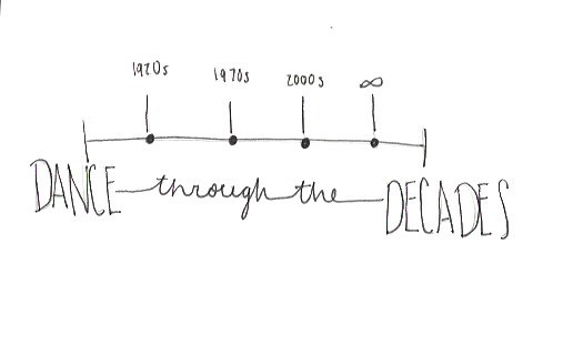
This is a very rough idea of what I would like my logo to look like. I wanted to play on the idea of a timeline since my theme is “Dance Through the Decades”. However, I would like to find a way to make it a bit simpler.

Category Cloud

Audition Illustrator Logo My Story on the Web Photography Photoshop Premiere Tutorials
Blog at WordPress.com.
Privacy & Cookies: This site uses cookies. By continuing to use this website, you agree to their use.
To find out more, including how to control cookies, see here: Cookie Policy
  • Subscribe Subscribed
    Dance Through the Decades

    Have a WordPress.com account? Log in now.

  • Dance Through the Decades
    View site in Reader
    Manage subscriptionsSign upLog in
    Report this content
    Collapse this bar
Loading Comments...
Design a site like this with WordPress.com
Get started